Role
User Research
Product Strategy
UI Design
Interaction Design
Usability Testing
Tools
Figjam
Figma
Notion
Maze
Zoom
The Problem
The Solution
Research Approach
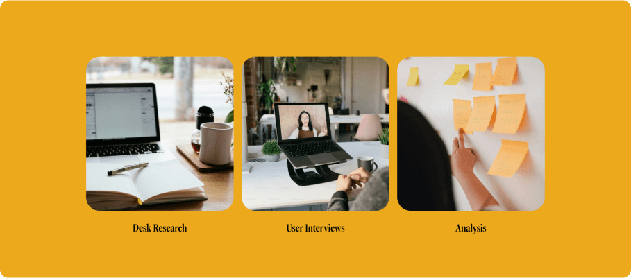
Over the course of 10 weeks, I worked to design a solution to improve the introduction into motherhoood. I started with discovery, moved to research and ideation, and then one to design and testing.
My target audience was women who have given birth in the last year and a half. The focus is on moms because they are not only caretakers but also dealing with the physical and psychological effects of childbirth, a detail that is criticial to the research. Typical persona data such as location, marital status, income, etc. was omitted because those factors are not crucial to the research topic.
Identified already existing solutions
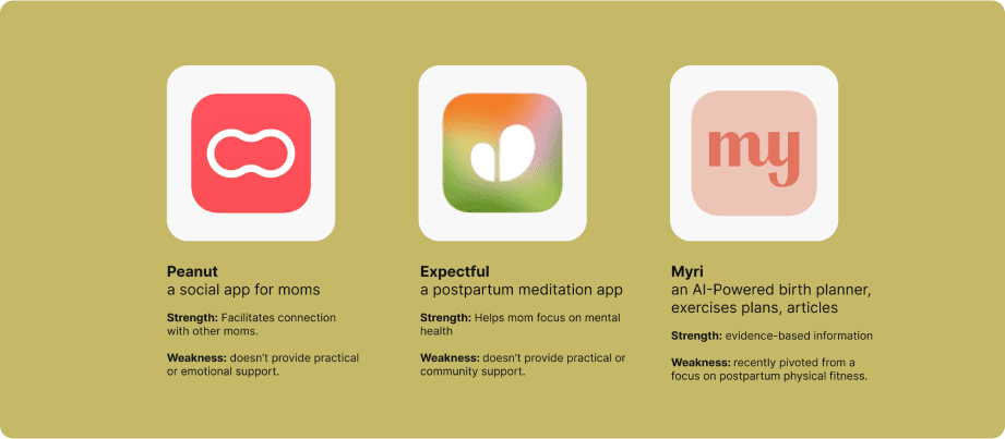
The majority of apps on the market focus on baby development but lack adequate postpartum support for mothers. I discovered two indirect competitors, Peanut and Expectful, and one direct competitor, Myri. All the products had strenghts and weaknesses but none offered a comprehesive solution.
Listened for ways to make life better
A large portion of the time was dedicated to research and analysis. It was crucial to understand the postpartum journey. I conducted six interviews with new moms aged 25-35 to explore their pain points and opportunities for addressing unmet needs.
Discovered key insights
In five out of six interviews, a common sentiment emerged:
People often don’t discuss the challenges of postpartum and the shock of all the unexpected challenges to this new reality can be tough.
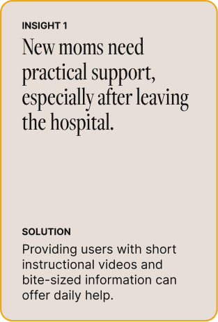
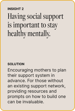
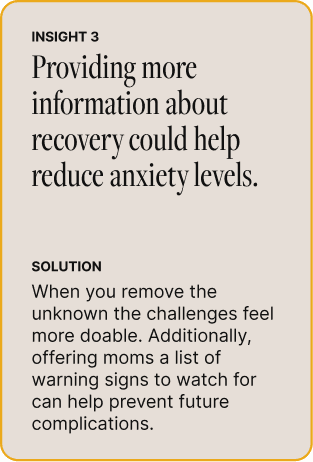
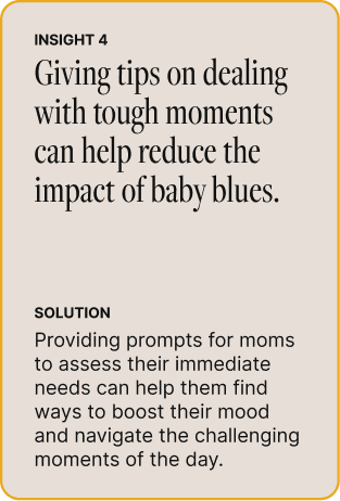
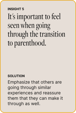
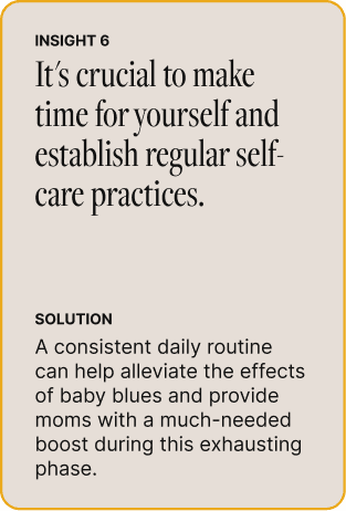
After analyzing all of the qualitative data, I discovered six key insights and potential solutions to guide the ideation process.
Defined personas
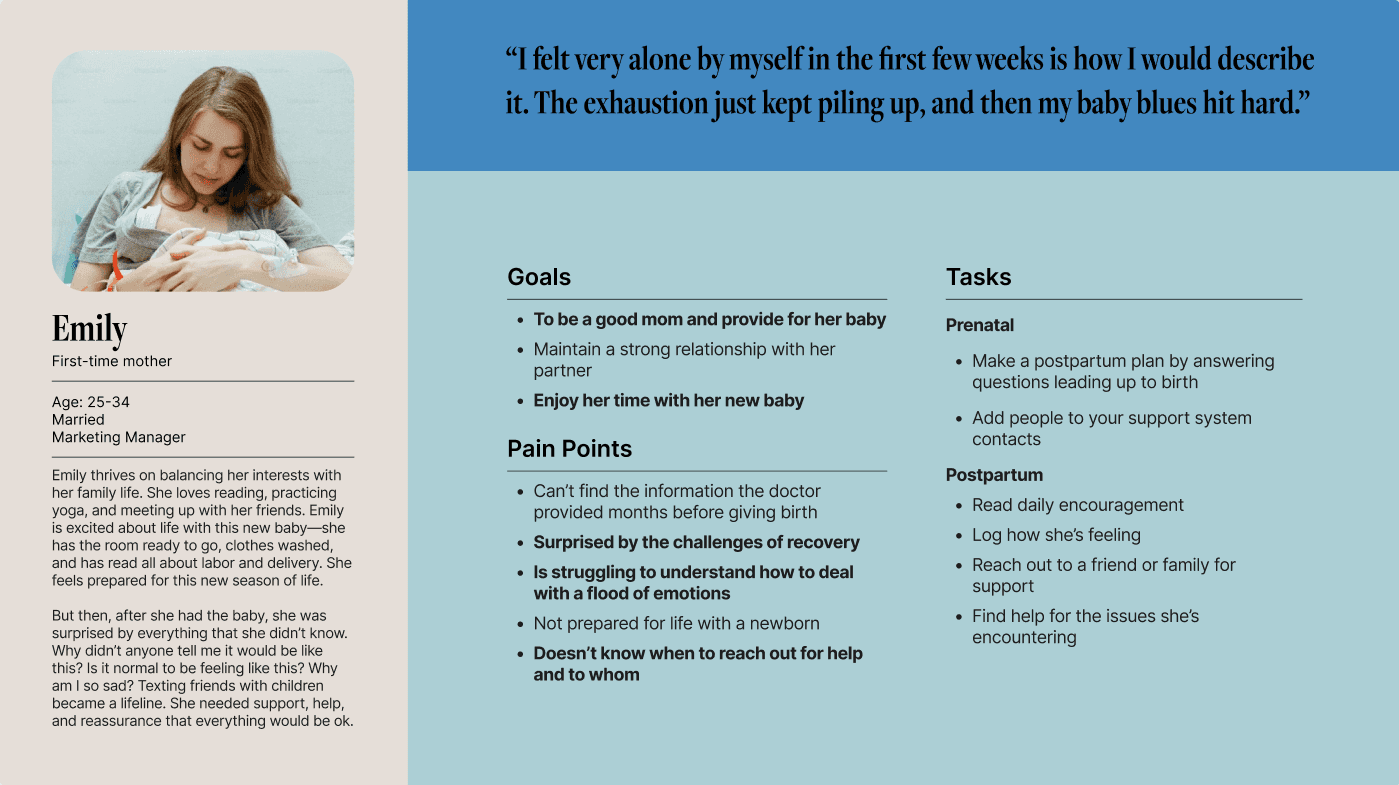
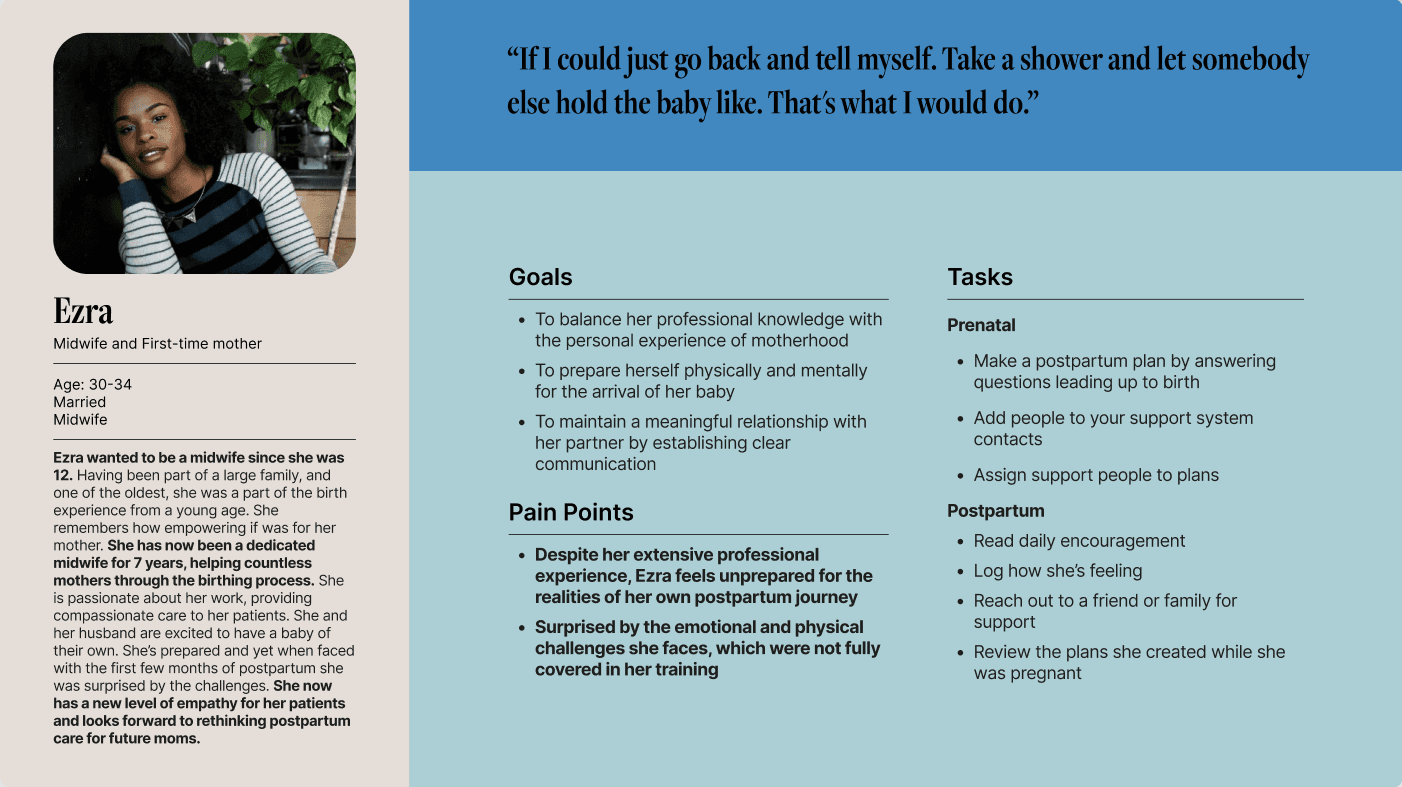
I defined two user personas, the first and primary group consisted of first-time moms with no additional medical knowledge or experience. The second persona was a new mom but unlike the first, she had been a postpartum nurse and is currently a midwife. Her experience will remove some of the challenges the first persona experiences.
Illustrated current user journey
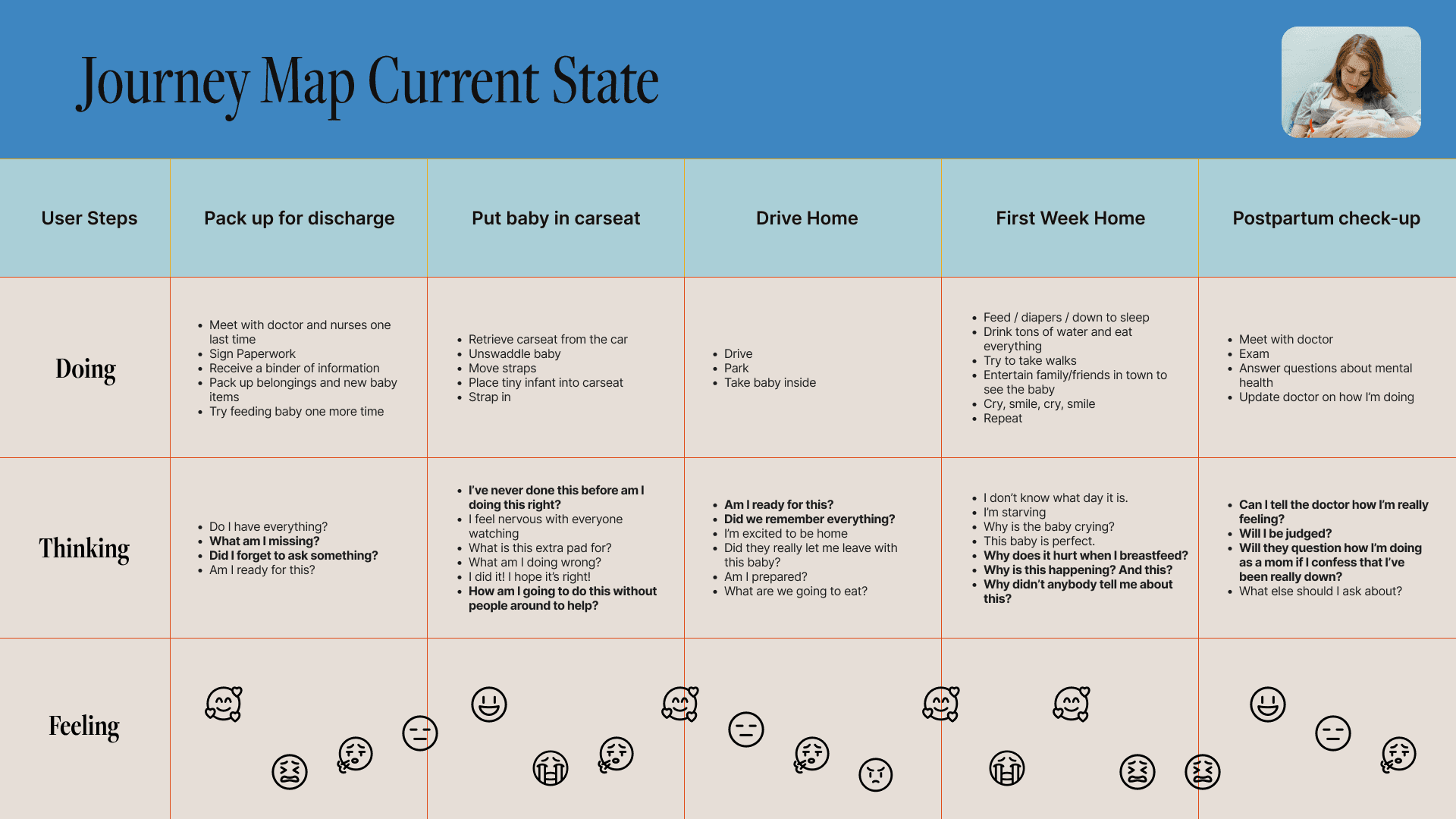
After talking with six moms, the data was clear: the postpartum period is like a rollercoaster. I used more emojis than usual in the Journey Map to show how the experience feels. Honestly, a mom can feel all of those emotions at once, multiple times a day. At each stage of the journey, a mom is confronted with new situations, most of which she hasn't prepared for, such as: "I've packed up, what am I missing?" "Did I forget to ask something?" "I've never done this before, am I doing this right?" "Why is this happening?" "Will they question how I'm doing as a mom if I confess I've been really down?"
The future journey with Mom's Pocket Support
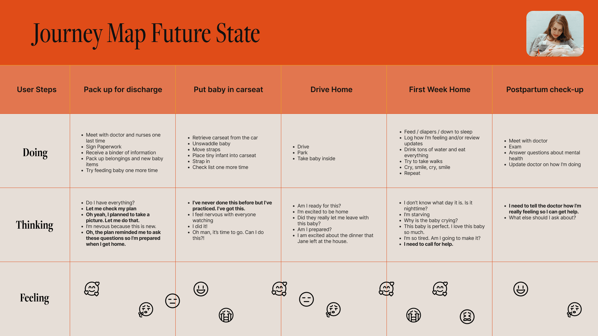
It's idealistic to think that an app could solve all the problems a mom faces. But if Mom's Pocket Support could take a handful of those emojis and make them disappear. This product would be a success. Now when she packs up to leave she can grab her phone and say, Let me check my plan. "Oh yeah, I need to ask these questions so I’m prepared when I get home." "I’ve practiced. I’ve got this." or "I need to tell the doctor how I’m really feeling so I can get help." She will still have to face the unknown because she's never done this before, but she'll feel more empowered to face the challenges.
Refining a solution
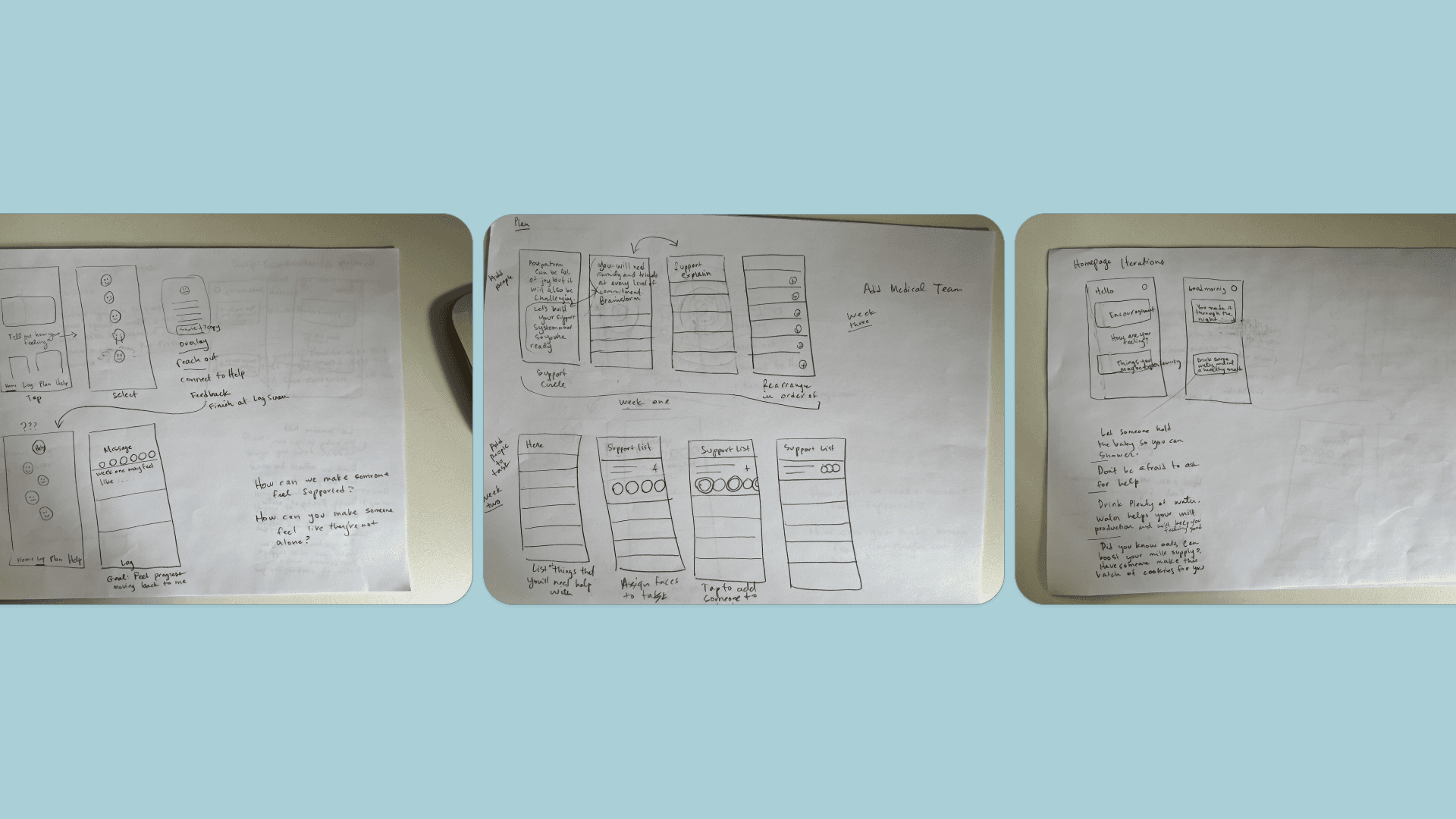
The research phase was very productive and left me with key insights to apply to a potential solution. I jumped to paper and began sketching out possible solutions and taking notes—getting my ideas on paper. Then, I moved on to Wireflows to think through the flow of information.
Bringing the design together in a prototype
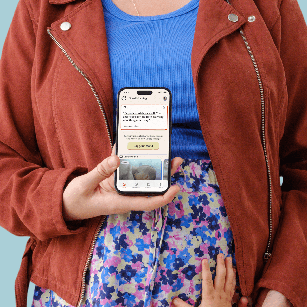
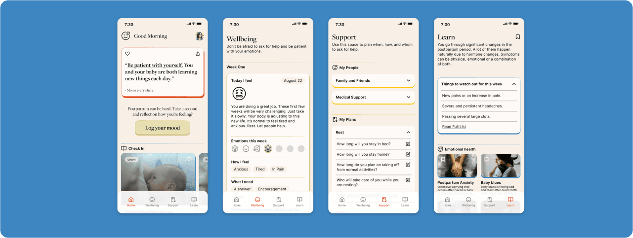
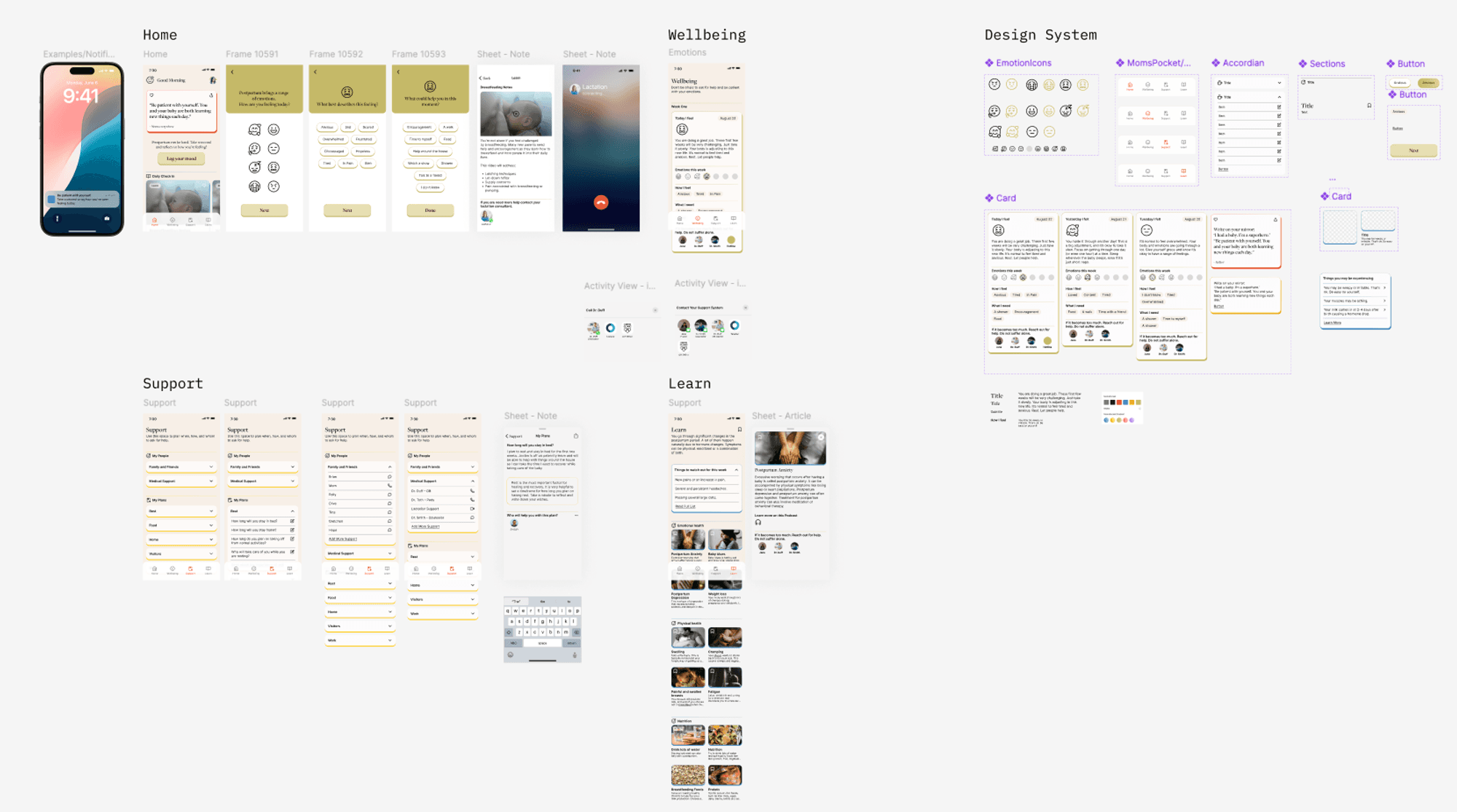
Finally, a hi-fidelity iteration. I incorporated multiple rounds of feedback refining the solution even more. Understanding from the research that moms are exhausted during the postpartum phase guided my design choices. The design needed to be visually appealing yet minimal, ensuring a light mental load. The features should be clear and utilize already existing mental models to make navigation intuitive. Finally, users should be able to easily access support options without having to remember their location within the app.
Tested usability with users
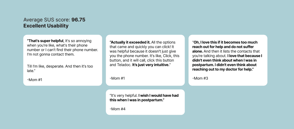
With the prototype, I conducted four usability test interviews with my primary persona to assess the efficiency of use, the ease of finding information, and the effectiveness of the user interface.
Test outcomes
The results were promising: the app received high usability scores due to its intuitive design, helpful content, and easy access to a support system. I also discovered two new things to explore in the next iteration. Finally, gathering feedback on a specific content question that I had in the emotional log feature.
Three key learnings
Prioritization can be difficult, especially when the research is fascinating. I found it challenging to stop researching and shift my focus to designing.
Feedback is crucial to making a product the best it can be.
Collaboration transformed my approach to design, shifting my focus from designing for the sake of design to designing for a better user experience.
Next steps
More research is needed to understand the needs and constraints faced by health care professionals. Second, to make the product as helpful as possible it's imperative to have a clear and thorough plan for the information to be delivered. Finally, the design team can start working on the smart watch UI, specifically making it easy for a mom to log her mood from her smartwatch.
